For Remodelers, Mobile-Users are Mobile Buyers

No one knows the value of mobile users better than Google. Last month, Google announced the results of their recent data analysis on mobile users and found that these searchers were 51% more likely to make a purchase than their desktop counterparts. While 51% is a huge number, what’s surprising is that this trend is even more significant for remodelers (but more on that below).
That’s a killer insight! The majority of people searching on their phones for your services are more ready to convert and buy your product, which further emphasizes the importance of catering your website to mobile-device users. What is Google’s preferred way to help mobile-device customers navigate your website and buy your products? Responsive web design, of course.
Responsive Design, 101
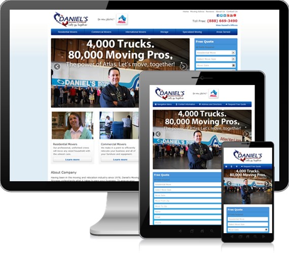
Responsive web design is a 3-part design strategy that makes a single website easy to use and navigate, whether you’re on a desktop, tablet or smartphone.
- It scales the same content to fit any screen seamlessly – meaning that your web experience is fundamentally the same, regardless of what device you are using.
- It’s convenient to use on mobile – the size of buttons increases to facilitate touch screens, and the phone number has the click-to-call functionality that mobile users now expect.
- It’s fast. The site has to load in 5 seconds or less to avoid penalties from Google– after all, Google knows that a significant delay causes users to get frustrated and click off-site without buying.
What does this mean for your remodeling company?
So, what are you missing if you aren’t in responsive design? Well, that varies by industry. For remodelers, the shift to mobile has been particularly important. After all, a remodeling project is large and high risk, so a customer has a longer research window than, say, buying a toaster.
A quick overview from our remodeling partners:
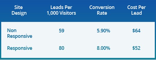
Here we take a 3 month window and compare it to the same 3 months the year prior, the main difference being that we implemented responsive design. With seasonality taken into effect, we saw a sharp improvement for our remodeling partners when we introduced the first version of our responsive software. Conversion rates rose by more than a third. Cost-per-lead dropped by a fifth. Mobile-users loved the design, and were far more likely to get in touch with the companies that had it.

That’s like a 20% off coupon for your web marketing program, just by implementing a more user-friendly design!
A quick word of caution – we implemented our design after dozens of hours of testing by our expert programmers. If you have a template-driven website, like WordPress, your site may appear mobile-friendly—but do your testing! Have a look at your quote forms and headers in particular, these tend to break on template-driven responsive sites, and a broken site will not drive customer growth.
Tags
Responsive Web Design Responsive Website Design Mobile Marketing mobile website


