A Business Owner's Guide to "Mobilegeddon"
The largest growth opportunity for small and medium sized businesses is the explosion of mobile technology in the last two years. Have any doubts? Between 2014 and 2015, mobile searches for keywords related to exterior remodeling have risen by 65%. This comes from Google’s own search data. That means that nearly half of your potential customers are looking for you on a smartphone or tablet. If your site isn’t optimized for these users, you are missing out on nearly half of your potential leads.

Google’s Take on
Mobile Opportunity
So, how do you take advantage of this radical shift in the market? What is the best way to capture mobile users and turn them into customers? Google has a few recommendations.
- Build one website for all users. Separate mobile sites are a burden to administer, and ultimately shortchange your customers with new content being delayed for half of your entire audience. Google recommends against (and penalizes you for) sending your mobile users anywhere but your main site. Google’s preferred solution is Responsive Web Design, using one site scaled to all devices.
- Build for speed. One of the major changes in Google’s “Mobilegeddon” update in 2015 was to move mobile-friendly sites up in search rankings. One of the key considerations to being mobile-friendly is loading in under 5 seconds on a low-speed mobile connection.
- Build with current gen technology. Mobile moves incredibly fast– the first iPhone was released in 2007. By 2015, we were on the 9 generation of iPhones, each with its own operating system and design. Staying at the cutting-edge and making the most of the mobile opportunity will require savvy business owners to keep up-to-date on what works best. Luckily, tools like the Google PageSpeed Insights are available in our downloadable mobile resource guide. See how your site is doing, and perform these tests regularly.
Our Take on Mobile Opportunity
As a turn-key digital marketing firm, how do we stay on top of these developments that are moving a mile-a-minute? Well, early in the mobile explosion, we made a fundamental change to our site-building philosophy. We only build websites in Responsive Web Design. Why engineer a site for half of your customer base, and then hack together a solution for the other half? A responsive site is future-proofed– a flexible solution to a complex branding problem.
Here is our design strategy:
Build for mobile first – with the right team of web designers and
developers, you can have a beautiful site across all devices. We start from
mobile and scale to desktop, so we are never playing catch-up with new
technology.
Keep ahead of search formula changes – our digital marketers have all of the tools and expertise required to create websites that generate traffic and sales for our clients. If we don’t have the tools, we have a team of developers in-house to build them from scratch.
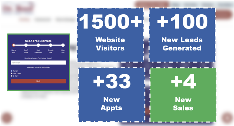
Design for lead generation – ultimately, the engine that grows your home services business is a stream of sales leads. Creating our websites, from the mobile-view to the fields on the quote forms, our goal is to put qualified customers into your sales pipeline. Wonder if we’re any good at generating leads? Have a look at our results in the remodeling or moving industry.
There you have it! Mobile devices are growing by leaps and bounds in capabilities and popularity. Google knows this, and has altered their search formula to move mobile-friendly websites up in the search results. Cutting-edge web design firms know this, shifting their site development to accommodate mobile users. Ask yourself what steps your company is taking to turn this radical change in search behavior into new customers. If the answer is “not enough,” it’s time to rethink your approach.
Tags
Responsive Web Design Responsive Website Design mobile lead generation Mobile Marketing mobile website


