4 Amazon.com Conversion Strategies You Can (and Should) Use on Your Website

In 2012, Amazon.com went down for 49 minutes. As a result, the company lost nearly $6 million in sales.
Six. Million. In less than an hour.
On average, each unique visitor will spend about $189 with Amazon. To put this in perspective, that’s five times more than what eBay’s unique visitors spend.
Amazon’s success boils down to 3 things they’re doing right:
- Enormous Selection (Amazon’s warehouses have more square footage than 700 Madison Square Gardens)
- Great Prices (Amazon’s profit margins are extremely thin, which ensures long-term customer loyalty and trust)
- Conversion Power (Every Amazon.com page is designed to encourage and help people buy products quickly and easily)
This article is about the “conversion power” part, and how you can put it to use on your own website. Here are 4 pointers to get you started:
1. Make an all-in-one search bar
If your website has search functionality, it should be smart. Your search bar results should yield more than just the services or products your company sells. It should act as a catch-all for everything on your website.
For example, type “return policy” into Amazon’s search bar and the first result (out of over 800 thousand, mind you) will be “About Our Return Policies”.
Now that’s smart. And people love it because it’s convenient.
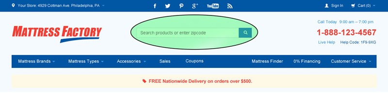
Spectrum implemented this type of one-and-done search functionality on The Mattress Factory’s site, which allows customers to find other useful information besides product info. If the customer enters their zip code, for instance, they’ll see the store nearest to them -- not an error page.
Many competing mattress retailers have a separate “store locator” search bar, which is just another opportunity for potential customers to become distracted and not take action.
Less is better.
2. Create location-specific content
If you’re browsing Amazon.com in the UK, you’ll be shown prices in pounds. Shoppers outside of the States don’t have to make any specific changes to their settings -- Amazon will just read your IP address and make the adjustment automatically.
Given how convenient this is, The Mattress Factory is in the process of implementing its own form of location-specific content. Soon, visitors will see the Mattress Factory store closest to them prominently displayed in the top-left corner of their screen. This is calculated based on the visitor’s IP address, and will save prospects the extra step of entering their zip code.
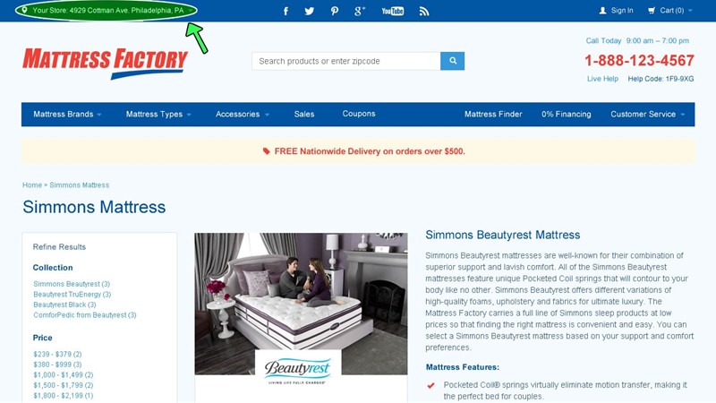
This does not, however, make The Mattress Factory’s all-in-one search bar obsolete, as prospects can use it to locate more than just store locations (e.g., warranty info, financing options, buying guides, guarantees).
Location-specific content makes important, pertinent information more accessible. This, in turn, makes user experience easier and conversion rates higher.
3. Show a call-to-action banner
Here’s how to put your company’s most exciting promotions directly in front of your customers without being annoying. We call it a call-to-action banner:
Amazon features something like it on almost every single page: a thin, subtle strip of copy. It’s interesting because it’s not too pushy -- nothing like an obnoxious popup ad -- but it’s still right there, always in the customer’s line of sight.
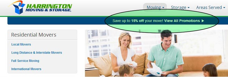
Harrington Moving & Storage, another Spectrum client, has a call-to-action banner on every page. It prompts visitors to find out how they can save 15% on their next relocation.
And it’s helped them sell a lot of moves.
4. Send follow-up emails
This one’s to ensure that your customers come back.
It may not seem necessary, but a simple “thank you” can go a long way -- especially online, where things can get pretty impersonal sometimes.
Every time you make a purchase on Amazon, you’ll receive an email thanking you for your order and confirming that it went through successfully. It’s a virtual receipt as well as a virtual smile. It also encourages people to leave reviews.
WindowWorks, a major remodeling company and Spectrum client, sends a confirmation email to each lead it receives. Because doing so isn’t only courteous, it’s good business.
It reminds people that help is on its way. It makes people feel good about your customer service (before they even speak with anyone from your company). And, most importantly, it discourages people from seeking a solution to their problem elsewhere. If you know the tow truck's coming, there’s no need to accept help from a Good Samaritan. The tow truck will be there soon!
Ultimately, you don’t want to be a company that responds to leads ONLY as quickly as your employees are able to. In other words, if someone requests a quote at 5:30 PM on a Friday, they shouldn’t have to wait until Monday morning to hear from you. This period of time will only give prospects an excuse to look elsewhere.
Your auto-email can be as simple as:
“Thanks, we’ve successfully received your quote request and will get back to you as soon as possible!”
Even something as crude and generic as this will buy you time and help you secure the sale.
I know what you’re thinking...
This is minor stuff.
To which I’ll say: it is and it isn’t.
Just because it’s easy to implement doesn’t mean it won’t make a profound difference. The devil, after all, is in the details. And if the details of your website are rough around the edges, you’ll rub people the wrong way.
Minor features like these can have a major impact on your bottom line because they make it easier for people to buy services and products through your website.
Amazon knows that making the buying process more intuitive for customers will result in more sales. The aforementioned strategies make using their website simple and streamlined -- even fun.
The good new is: you can do it, too.
Already doing these things? Share your experience in the comments below!
Need helping implementing some of these strategies? Get in touch with Spectrum HERE!
Tags
Amazon call-to-action increased conversions Sales